Thursday, October 23, 2008

Cartogram

Cartogram

Cartograms which are called as diagrammatic maps are used for spatial transformations. A cartogram is a graphic that shows the attributes of geographical objects as the object’s area. Cartogram is a well-known technique showing geography-related statistical information, such as population demographics and epidemiological data. The basic idea is to distort a map by resizing its regions according to a statistical parameter, but in a way that keeps the map recognizable. Using cartograms, regularities in the spatial distribution phenomena and interactions among them can be observed more easily. These are used in geographical investigations, especially for electoral votes or population counts purpose. Cartograms are classified into two categories, they are • Linear • Area Area Cartograms are referred as value-by-area map or isodemographic map particularly used for population cartograms, which uses the relative sizes of the populations of the countries of the world, by scaling the areas of each countries to the proportion of its population. Distance Cartogram is also called as central-point cartogram. This is used to show relative travel times and directions from vertices in a network. Cartograms vary on their degree in which geographic space is changed; some appear very similar to a map, however some look nothing like a map at all. There are three main types of cartograms, each have a very different way of showing attributes of geographic objects- Non-contiguous, Contiguous and Dorlingcartograms.


NON-CONTIGUOUS CARTOGRAMS

Non-contiguous Cartogram is the simplest type of the cartogram. In this the geographic objects do not have to maintain connectivity with their adjacent objects. This connectivity is called as topology. By freeing the objects from their adjacent objects, they can grow or shrink in size and still maintain their shape.


CONTIGUOUS CARTOGRAMS


In contiguous cartogram topology is maintained , but this causes great distortion in shape. This leads to the single most difficult, but intriguing problem in creating cartograms. The cartographer must make the objects the appropriate size to represent the attribute value, but he or she must also maintain the shape of objects as best as possible, so that the cartogram can be easily interpreted.


DORLING CARTOGRAMS


This cartogram is named after its inventor Danny Dorling of the University of Leeds. A Dorling cartogram maintains neither shape, topology nor object centroids, though it has proven to be a very effective cartogram method. To create a Dorling cartogram, instead of enlarging or shrinking the objects themselves, the cartographer will replace the objects with a uniform shape, usually a circle, of the appropriate size. Professor Dorling, for the reason described above in the non-contiguous cartogram section, suggests that the shapes not overlap but rather be moved so that the full area of each shape can be seen. Another Dorling-like cartogram is the Demers Cartogram, which is different in two ways. It uses squares rather than circles; this leaves fewer gaps between the shapes. Secondly, the Dorling Cartogram attempts to move the figures the shortest distance away from their true locations; the Demers cartogram often sacrifices distance to maintain contiguity between figures, and it will also sacrifice distance to maintain certain visual cues. Most Populated Counties in California are labeled in each of the two cartograms below for reference.


PSEUDO-CARTOGRAMS


Pseudo-cartograms (or false cartograms) are representations that may look like cartograms but do not follow certain cartogram rules. Perhaps the most famous type of pseudo-cartogram was developed by Dr. Waldo Tobler. In this case, instead of enlarging or shrinking the objects themselves, Tobler moves the object's connections to a reference grid such as latitude or longitude in order to give the same effect. This maintains good directional accuracy in the cartogram however, this is a false cartogram because it creates extensive error in the actual size of the objects.

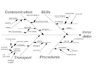
Cause and Effect Diagram

Cause & Effect Diagram

The cause and effect diagram was first used by Kaoru Ishikawa in 1943 to explain to a group of engineers working in Kawasaki steel works about working process and how various work factors could be stored and related. For this reason these diagrams are called as Ishikawa diagrams, and also called by many names like fish-bone diagrams because they look like a fish skeleton. These are also called as Cause and Effect diagrams because they help us to think of all the possible causes of the problem instead of just considering the most obvious ones. These diagrams are one of the types used in quality management techniques. When utilizing a team approach to problem solving, there are often many opinions as to the problem's root cause. One way to capture these different ideas and stimulate the team's brainstorming on root causes is the cause and effect diagram, commonly called a fishbone.

This diagram provides a structured way to help you think through all possible causes of a problem. This helps us top carry out a thorough analysis of a situation.

Steps to be followed to solve a problem using Cause and Effect diagram are:

  • Identify the problem
  • Work out the major factors involved
  • Identify possible causes
  • Analyze your diagram

To construct a fishbone, start with stating the problem in the form of a question, such as 'Why is the help desk's abandon rate so high?' Framing it as a 'why' question will help in brainstorming, as each root cause idea should answer the question. The team should agree on the statement of the problem and then place this question in a box at the 'head' of the fishbone.

The rest of the fishbone then consists of one line drawn across the page, attached to the problem statement, and several lines, or 'bones,' coming out vertically from the main line. These branches are labeled with different categories. The categories you use are up to you to decide.

You should feel free to modify the categories for your project and subject matter.

Once you have the branches labeled, begin brainstorming possible causes and attach them to the appropriate branches. For each cause identified, continue to ask 'why does that happen?' and attach that information as another bone of the category branch. This will help get you to the true drivers of a problem.

Once you have the fishbone completed, you are well on your way to understanding the root causes of your problem. It would be advisable to have your team prioritize in some manner the key causes identified on the fishbone.

Cause Enumeration

In general, it is difficult to identify which are the main causes. In such situations there are ways of identifying them effectively.

  • Brain storm and get a list of causes.
  • Sort the list by grouping
  • Identify each group by giving a name and make your cause and effect diagram.

The advantage of the cause enumeration technique is that you stand a much better chance that all causes will be listed, especially hidden ones, and your diagram will be a complete and useful picture. The disadvantage is that it may be difficult to relate all the causes clearly to the result, making the diagram hard to draw.