Monday, April 20, 2009

AND


Activity Network Diagram(AND)

An Activity Diagram is also called as an Arrow Diagram, because it has arrows in it. It is also known as PERT(Program Evaluation Review Technique). This diagram is mainly intended to identify the time sequences of events which are pivotal for the project. This helps for comprehending the event sequences driving them towards the achievement of objectives prioritizing the time requirements. This diagram is useful when a project has multiple activities to be handled effectively.

This started out as an engineering and construction project management tool. It helps in finding out the most efficienrt sequence of events needed to complete the project. It facilitates us to create a very realistic project schedule by graphically showing

The total amount of time needed to complete the project

The sequence in which tasks must be carried out

Which tasks can be carried out at the same time

Which are the critical tasks that you need to keep an eye on

Procedure for development

Identify all activities and relationships among them.

Sketch the diagram.

Estimate the times for each activity, or node, in the diagram .

Determine the critical path.

Evaluate the diagram for milestones and target dates in the overall project.

Drawing Rule

All the preceding activities must be completed before the project can begin.

The arrows represent the logical precedence of the project.

When to Use It

Use it when planning any project or activity which is composed of a set of interdependent actions.

Use it to calculate the earliest date the project can be completed, and to find ways of changing this.

Use it to identify and address risk to completing a project on time.

It can also be used for describing and understanding the activities within a standard work process.

The resulting diagram is useful for communicating the plan and risks to other people.


History

It was developed by the U.S. Department of Defense. It was first used as a management tool for military projects. It was Adapted as an educational tool for business managers.


Example of Activity Network Diagram

A project is composed of a set of actions or tasks which usually have some kind of interdependency. For example, before an axle can be turned, it must first be designed, the metal must be purchased, etc. This type of complex system is much easier to understand through the use of diagrams than through textual description, as actual interconnections between tasks can be shown. You can draw the activity network diagram easily with Edraw software.


The Activity Network diagram displays interdependencies between tasks through the use of boxes and arrows. Arrows pointing into a task box come from its predecessor tasks, which must be completed before the task can start. Arrows pointing out of a task box go to its successor tasks, which cannot start until at least this task is complete.

A project team in a chain store, working on a problem with the customer response process, came up with a solution that required careful implementation. They decided to use an Activity Network to plan and manage this stage, with the key objective of implementing the solution with no degradation of service to customers at any time.

They used cards with a Tree Diagram to identify the tasks that would need to be done, then transferred the bottom-level tasks, one at a time, to the Activity Network and completed this with effort estimations and dependency links between tasks. They then entered it into a computer system to calculate timings, perform resource smoothing and help reduce slack time.

The plan showed that the time and effort in implementation would fall outside their budgeted figure. They consequently took the plan to the steering committee to get authority to spend additional time on the project. The implementation went very smoothly.


Friday, April 3, 2009

Rich Picture


Rich Picture

A rich picture is a way of representing the things what we know about a situation.- the issues, actors, problems, processes, relationships, conflicts and motivations – which creates a valid reason about these aspects. It is a graphical tool addressing the state of ambiguity at the beginning of any exploration or research about an issue. It is the first step in the process of assessment of a situation. It gives a clear idea about the entire scenario like what is the exact problem , what are the various factors related to it. By seeing at this we come to know the complete picture of the problem. This makes us to know that we are dealing with a problematic situation, and takes us to a state where we have identified one or more themes we want to deal with. Peter Checkland is the person who introduced the concept of rich pictures to the world. He is a British management scientist. He designed this for use in the early stages of his Soft Systems Methodology (SSM), an approach that recognizes that problems do not exist separate from the people involved in them and appreciates the multiple viewpoints of those participants. Essentially, SSM attempts to understand human systems in a way that is meaningful to actors in that system. SSM says that humans are the part of any problem or project that arises, they are no more separated. Rich pictures are tools to learn not only about the observable particulars of a situation, but also about the abstract or emotional things like the social atmosphere among the actors. This is called as a Rich Picture because it is very much rich with the information.

Soft Systems Methodology(SSM) is an methodology used for organizational process modeling. This is used for both general problem solving and also in the management of change. This works on the concept of system thinking. System Thinking is a concept that explains that the component part of the system will act differently when it is isolated from its environment.
.

Constructing rich pictures can reveal all sorts of questions and observations about the problem situation. The value of rich pictures becomes particularly clear when we share it with others, identifying different perceptions of and assumptions about what is going on. That is when we can see connections, dead-ends, possibilities and contradictions that we may have otherwise missed. It can be difficult to face other people’s often surprisingly different assumptions, because this exposes us to the demanding task of questioning our own. It can mean throwing away the solutions we thought we had, going back to the beginning and starting anew. Of course, that is often exactly what is needed at the start of a systemic inquiry.

The aim of this rich picture is to make a pictorial representation of the elements that need to be considered when inquiring a problem, like the stakeholders and issues, the interactions and connections and links between them. This picture can identify the points that are to be monitored, the pin points, the change agents, the change effects , etc.,

Rich Pictures are helpful in identifying the open loops in the system and also the redundant ways of checking at the early stage. Major issues will show up relatively easily. It can be a useful tool to compare the differences before and after process review.

Rich pictures are drawn at the pre-analysis stage, before you know clearly which parts of the situation should best be regarded as process and which as structure.


Part of a rich picture of a telephone helpline situation

Rich pictures or situation summaries are used to depict complicated situations. They provide us with a summary of the situation that you are going to handle. They are an attempt to encapsulate the real situation through a no- holds-barred, cartoon representation of all the ideas covered already layout, connections, relationships, influences, cause-and-effect, and so on. As well as these objective ideas, rich pictures portray subjective elements such as the character and characteristics, points of view and discrimination, spirit and human nature. If you are working with a client you should try to draw these from the actors themselves, at least initially, rather than focusing on your own interpretation of the situation.

Elements of the Rich Picture:

  • pictorial symbols;
  • keywords;
  • cartoons;
  • sketches;
  • symbols;
  • title;

Constructing A Rich Picture


A rich picture of a rich picture from The Open University’s Faculty of Technology

Begin with large sheets of paper and lots of coloured pens, and then simply draw what you see happening. Draw all that you perceive as problematic or significant - emotions and relationships as well as groupings and connections of various sorts - using symbols and metaphors to represent the situation in a way that is explicit and understandable by others. A rich picture can cope with whatever chaotic mess of thoughts and perceptions flows onto the page. Rich pictures do not have a formal syntax, and different people take different approaches, but these general guidelines have emerged as being useful:

  • Structure. Structure is the part of the situation which is stable and very slow in changing. It includes things like organisational structure, geographic location, physical layout and all the people who are affected by the situation.
  • Process. Process is the transformation that takes place within the structure. This represents the change in the system. These transformations might be part of a flow of goods, documents, or data.
  • Concerns (Checkland calls these “issues”). Concerns represents the intention of an actor to participate in the situation. This depicts the perception of the actors.

  • Yourself. You should include yourself in the situation and clearly mention the roles and responsibilities.

A useful way to start a high level analysis is to identify players in the process. A quick and simple method is to use Rich Pictures - example below shows the players and the key interactions between them for the following simple tea-making scenario:

  1. Hostess asks who would like a cup of tea
  2. Visitors signify whether they want a cup
  3. Host is sent to put kettle on
  4. Hostess gathers information on preferences for sugar and milk
  5. Hostess gets sugar and milk ready
  6. Host brews and pours tea
  7. Hostess puts mugs on tray
  8. Host carries tray back to visitors and hands out mugs


Sources: John Naughton, Soft Systems Analysis: An Introductory Guide, The Open University Press, 1984; Andrew Monk and Steve Howard, The Rich Picture: A Tool for Reasoning About Work Context, 1998.

Monday, November 3, 2008

Warnier - Orr Diagram

Warnier-Orr diagram

Warnier-Orr diagram is a graphic charting technique used in software engineering for system analysis and design purposes. They were initially developed in France by Jean-Dominique Warnier & in the US by Kenneth Orr.This is a kind of hierarchical flowchart that allow the description of the organization of data and procedures.These diagrams are very much similar to the flow charts, but they look like pseudo code rather than blocks and shapes. These are the graphical representations of algorithms. These diagrams help the programmers work on, and record one problem before moving into the next problem or next part. So, that confusion in the complexity of the program will be reduced. This gives the ability to understand the logical structure of the program without getting confused in the complexity of that program. These diagrams are easy to understand and also easy to create. This method aids the design of program structures by identifying the output & processing results & then working backwards to determine the steps & combinations of input needed to produce them. The simple graphic method used in Warnier/Orr diagrams makes the levels in the system evident and the movement of the data between them vivid.

This diagram shows the processes and sequences very well. Each process is very well clearly explained as by having sub processes in it. These are represented by a bracket, grouping its components. Every process is designed in a hierarchical manner.

To construct a WO diagram, one should move backwards and construct it, such as start from the output and should do analysis backwards. There is a advantage of showing data in processes and in steps and sequences and also flow of data from level to level.

Lets have a quick description of elements of WO diagram

Bracket: A bracket encloses a level of decomposition in a diagram. It reveals what something "consists of" at the next level of detail.

Sequence: The sequence of events is defined by the top-to-bottom order in a diagram. That is, an event occurs after everything above it in a diagram, but before anything below it.

OR: You represent choice in a diagram by placing an "OR" operator between the items of a choice. The "OR" operator looks either like or .

AND: You represent concurrency in a diagram by placing an "AND" operator between the concurrent actions. The "AND" operator looks either like or .

Repetition: To show that an action repeats (loops), you simply put the number of repetitions of the action in parentheses below the action.

The diagram below illustrates the use of these constructs to describe a simple process.


You could read the above diagram like this:

"Welcoming a guest to your home (from 1 to many times) consists of greeting the guest and taking the guest's coat at the same time, then showing the guest in. Greeting a guest consists of saying "Good morning" if it's morning, or saying "Good afternoon" if it's afternoon, or saying "Good evening" if it's evening. Taking the guest's coat consists of helping the guest remove their coat, then hanging the coat up."

As you can see, the diagram is much easier to understand than the description.

The Warnier-Orr Diagram is read from left to right and from top to bottom within a bracket.

There are mainly 8 fundamental building blocks in this WO diagram, they are as follows:

· Hierarchy

· Sequence

· Selection

· Complement

· Repetition

· Concurrency

· Begin/End Blocks

· Recursion

Hierarchy:

Hierarchy on a Warnier-Orr Diagram is represented with brackets.


Sequence:

Sequence represents the order in which the tasks to be done, by listing them one below the other.

Selection:

Selection is used to allow choices between more than two tasks.


Complement:

Complement is nothing but the logical not condition.


Repetition:

Repetition provides looping.


Concurrency:

Concurrency allows different tasks to be done at the same time.


Begin/End Blocks:

Here, the Begin block holds the operations performed in the beginning of the task and End block contains operations performed at the end of the task.

Recursive:

Recursive block contains itself a sub process in it.


In this way, any process in any organization can be explained clearly to everyone, because its nothing but the step wise explanation of the task to be performed.

Thursday, October 23, 2008

Cartogram

Cartogram

Cartograms which are called as diagrammatic maps are used for spatial transformations. A cartogram is a graphic that shows the attributes of geographical objects as the object’s area. Cartogram is a well-known technique showing geography-related statistical information, such as population demographics and epidemiological data. The basic idea is to distort a map by resizing its regions according to a statistical parameter, but in a way that keeps the map recognizable. Using cartograms, regularities in the spatial distribution phenomena and interactions among them can be observed more easily. These are used in geographical investigations, especially for electoral votes or population counts purpose. Cartograms are classified into two categories, they are • Linear • Area Area Cartograms are referred as value-by-area map or isodemographic map particularly used for population cartograms, which uses the relative sizes of the populations of the countries of the world, by scaling the areas of each countries to the proportion of its population. Distance Cartogram is also called as central-point cartogram. This is used to show relative travel times and directions from vertices in a network. Cartograms vary on their degree in which geographic space is changed; some appear very similar to a map, however some look nothing like a map at all. There are three main types of cartograms, each have a very different way of showing attributes of geographic objects- Non-contiguous, Contiguous and Dorlingcartograms.


NON-CONTIGUOUS CARTOGRAMS

Non-contiguous Cartogram is the simplest type of the cartogram. In this the geographic objects do not have to maintain connectivity with their adjacent objects. This connectivity is called as topology. By freeing the objects from their adjacent objects, they can grow or shrink in size and still maintain their shape.


CONTIGUOUS CARTOGRAMS


In contiguous cartogram topology is maintained , but this causes great distortion in shape. This leads to the single most difficult, but intriguing problem in creating cartograms. The cartographer must make the objects the appropriate size to represent the attribute value, but he or she must also maintain the shape of objects as best as possible, so that the cartogram can be easily interpreted.


DORLING CARTOGRAMS


This cartogram is named after its inventor Danny Dorling of the University of Leeds. A Dorling cartogram maintains neither shape, topology nor object centroids, though it has proven to be a very effective cartogram method. To create a Dorling cartogram, instead of enlarging or shrinking the objects themselves, the cartographer will replace the objects with a uniform shape, usually a circle, of the appropriate size. Professor Dorling, for the reason described above in the non-contiguous cartogram section, suggests that the shapes not overlap but rather be moved so that the full area of each shape can be seen. Another Dorling-like cartogram is the Demers Cartogram, which is different in two ways. It uses squares rather than circles; this leaves fewer gaps between the shapes. Secondly, the Dorling Cartogram attempts to move the figures the shortest distance away from their true locations; the Demers cartogram often sacrifices distance to maintain contiguity between figures, and it will also sacrifice distance to maintain certain visual cues. Most Populated Counties in California are labeled in each of the two cartograms below for reference.


PSEUDO-CARTOGRAMS


Pseudo-cartograms (or false cartograms) are representations that may look like cartograms but do not follow certain cartogram rules. Perhaps the most famous type of pseudo-cartogram was developed by Dr. Waldo Tobler. In this case, instead of enlarging or shrinking the objects themselves, Tobler moves the object's connections to a reference grid such as latitude or longitude in order to give the same effect. This maintains good directional accuracy in the cartogram however, this is a false cartogram because it creates extensive error in the actual size of the objects.

Cause and Effect Diagram

Cause & Effect Diagram

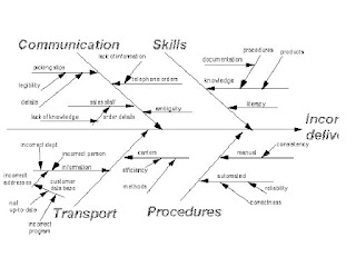
The cause and effect diagram was first used by Kaoru Ishikawa in 1943 to explain to a group of engineers working in Kawasaki steel works about working process and how various work factors could be stored and related. For this reason these diagrams are called as Ishikawa diagrams, and also called by many names like fish-bone diagrams because they look like a fish skeleton. These are also called as Cause and Effect diagrams because they help us to think of all the possible causes of the problem instead of just considering the most obvious ones. These diagrams are one of the types used in quality management techniques. When utilizing a team approach to problem solving, there are often many opinions as to the problem's root cause. One way to capture these different ideas and stimulate the team's brainstorming on root causes is the cause and effect diagram, commonly called a fishbone.

This diagram provides a structured way to help you think through all possible causes of a problem. This helps us top carry out a thorough analysis of a situation.

Steps to be followed to solve a problem using Cause and Effect diagram are:

  • Identify the problem
  • Work out the major factors involved
  • Identify possible causes
  • Analyze your diagram

To construct a fishbone, start with stating the problem in the form of a question, such as 'Why is the help desk's abandon rate so high?' Framing it as a 'why' question will help in brainstorming, as each root cause idea should answer the question. The team should agree on the statement of the problem and then place this question in a box at the 'head' of the fishbone.

The rest of the fishbone then consists of one line drawn across the page, attached to the problem statement, and several lines, or 'bones,' coming out vertically from the main line. These branches are labeled with different categories. The categories you use are up to you to decide.

You should feel free to modify the categories for your project and subject matter.

Once you have the branches labeled, begin brainstorming possible causes and attach them to the appropriate branches. For each cause identified, continue to ask 'why does that happen?' and attach that information as another bone of the category branch. This will help get you to the true drivers of a problem.

Once you have the fishbone completed, you are well on your way to understanding the root causes of your problem. It would be advisable to have your team prioritize in some manner the key causes identified on the fishbone.

Cause Enumeration

In general, it is difficult to identify which are the main causes. In such situations there are ways of identifying them effectively.

  • Brain storm and get a list of causes.
  • Sort the list by grouping
  • Identify each group by giving a name and make your cause and effect diagram.

The advantage of the cause enumeration technique is that you stand a much better chance that all causes will be listed, especially hidden ones, and your diagram will be a complete and useful picture. The disadvantage is that it may be difficult to relate all the causes clearly to the result, making the diagram hard to draw.


Thursday, September 11, 2008

Booch Diagrams


Booch Diagrams

Booch method of diagrams was designed by Grady Booch at Rational Software, prior to the invention of the well popular modeling language i.e., Unified Modelling Language(UML), as we all are aware of it.

Grady Booch was one among the designers of the "Unified Modeling Language". This UMl has its origin from this Booch method only.

This UML has its graphical elements drawn from this BOOCH method, and also elements from object modeling technique(OMT) and object oriented software engineering(OOSE).

Methodological aspects of the Booch method have been incorporated into several methodologies and processes, the primary such methodology being the Rational Unified Process (RUP).

HOW TO DRAW BOOCH DIAGRAMS

Grady Booch's Object-Oriented Design (OOD), also known as Object-Oriented Analysis and Design(OOAD), is a precursor to the Unified Modeling (UML). The Booch method includes six types of diagrams: class, object, state transition, interaction, module, and process.

Booch's Class and Object Diagram Notations

Classes:
Illustrate classes using a cloud shape with a dashed border.


You can find the Booch symbol libraries in SmartDraw under Software Design and Other Symbologies. Simply drag and drop shapes to the page and edit them.

Objects:
Draw objects using a cloud shape with a solid border.


Class:

Adornments Use adornments to provide additional information about a class. You can create an adornment notation using the basic triangle shape in SmartDraw. Place a letter inside the triangle to represent the following: A - Abstract. An abstract class cannot be instantiated because it represents a wide variety of object classes and does not represent any one of them fully. For example, mammal could be thought of as an abstract class. F - Friend. A friend class allows access to the nonpublic functions of other classes. S-Static. A static class provides data. V - Virtual. A virtual class is a shared base class, the most generalized class in a system.


Metaclass:
A metaclass is a class whose instances are also classes.


ClassCategories:
A class category represents a cluster of similar classes. Illustrate a class category by drawing a rectangle with two compartments.


ClassTemplates:
Draw a template using the standard class symbol attached to a box with a dashed outline. List template parameters or formal arguments in this box. When you draw a class created from a template, replace the dashed border with a solid one.


ClassUtilities:
Class utilities describe a group of non-member functions or subprograms. Illustrate a class utility with a shadowed cloud.


ClassVisibility:
Visibility markers signify who can access the information contained within a class. Public visibility allows an attribute or an operation to be viewed by any other class. Private visibility means that the attribute or the operation is only accessible by the class itself and its friends. Protected visibility makes an attribute or operation visible only to friend classes and classes that inherit it. Implementation restricts the accessibility of an attribute to the class only (not even friends have access to these attributes).

Place visibility markers next to the attribute they refer to.


ObjectVisibility:
Draw a visibility marker on a link to signify the relationship between the connected objects. These markers can be:

G-Global P-Parameter F-Field L–Local


Relationships
Indicate relationships between objects using lines and arrows.

Relationship Meaning

Aggregation (has)

Aggregation by value

Aggregation by reference

Uses

Instantiates - Compatible type

Instantiates - New type

Inherits - Compatible type

Inherits - New type

Metaclass

Undefined

Booch'sDynamicDiagrams:
Use state transition and interaction diagrams to illustrate the dynamic nature of an application. Below is a table that lists what each of the dynamic Booch diagrams corresponds to in UML.

Booch (OOD)

Unified Modeling Language (UML)

State transition diagram

State chart diagram

Interaction diagram

Sequence diagram

Booch's Dynamic Diagram Notations

State:
States represent situations during the life of an object. Draw a Booch state symbol using a rectangle with rounded corners and two compartments. Use the oval-shaped H symbol to indicate the most recently visited state.


Booch's Physical Diagrams:

Draw module and process diagrams to illustrate the physical design of your application. Module diagrams correspond to UML's component diagrams and process diagrams correspond to UML's deployment diagrams.

Booch's Physical Diagram Notations

Processor:
Processors are hardware pieces that execute programs. Use devices and processors to draw process diagrams.


Device:
Use a device notation to illustrate hardware that is not capable of executing programs.


Modules:
A module is a unit of code that serves as a building block for the physical structure of a system. The specification module contains the declaration of entities and the body module contains the definition of entities.


MainModule:
This module is the main program from which the system is activated.


Subsystem:
A subsystem refers to a collection of related modules.


Example of Booch Diagrams:


This is a little about Booch Model of Diagrams , you can explore it as much as you can. I hope you all will do so.

Thank You

Fathima. MD